


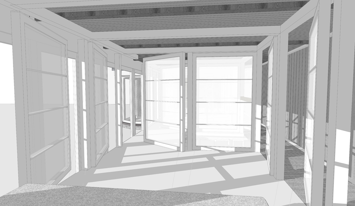


Materials, represented are Bronze:handrails, Flamed Basalt: bathroom walls and floor, and White pine:walls and storage. Light pivoting and sliding shoji style screens to provide privacy and diffuse the light through the space.


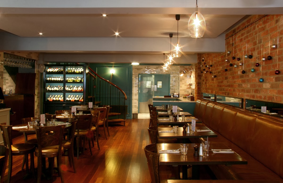

 As the space when you enter seems to divide into halves we intentionally made the decision to work with some of the through bar views and using mirror where necessary to give reflection of other spaces and angles that gives a better and useful sense of wholeness.
 The tanned, distressed leather banquet seating was existing and became a strong


 Here you can see the extension at its fullest. The ribs that allow air to flow, and keep the leafs flat. The leg side stretchers were given a shoulder support in the main stable leg in order to taxi along allowing it to be a guide for re-completing the closure. See below.

 From the kitchen door, a large bank of fully fitted units utilise every inch of space from floor to ceiling, and conceal the underfloor heating elements, integrated fridges, freezers and wine storage, bread drawers and cheese shelf, leaving an ample pantry section.


